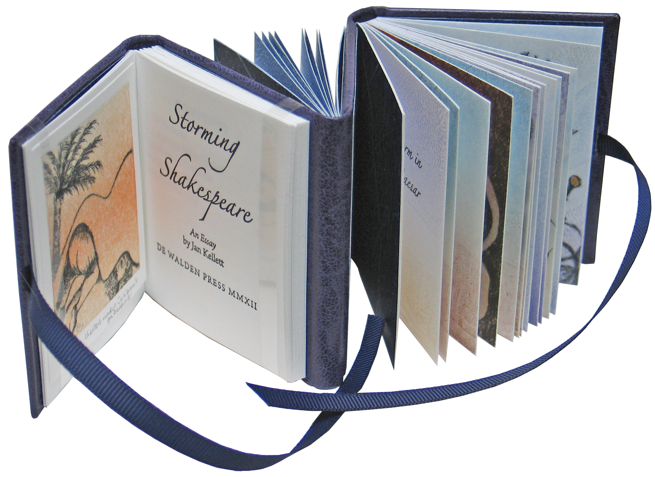
My passion for Shakespeare's work is no secret and this is a book I've been planning for some time. Plays are by their nature very visual, and Shakespeare's texts conjure up a richness of colour and imagery that I wanted to show on the page in "Storming Shakespeare". I concentrated on three of his plays, "Julius Caesar", "King Lear" and "The Tempest" to explore his use of the storm, and have quoted from and illustrated them in the second and third sections of the book.

The storms in these plays vary in character according to the temper and mood Shakespeare wants to convey. In "Julius Caesar" the storms are hot, dry and fiery; in "King Lear" very wet, windy and blustery; in "The Tempest", the storm and shipwreck created by Prospero's magic are enacted on stage, giving the audience a direct experience of this as it happens.
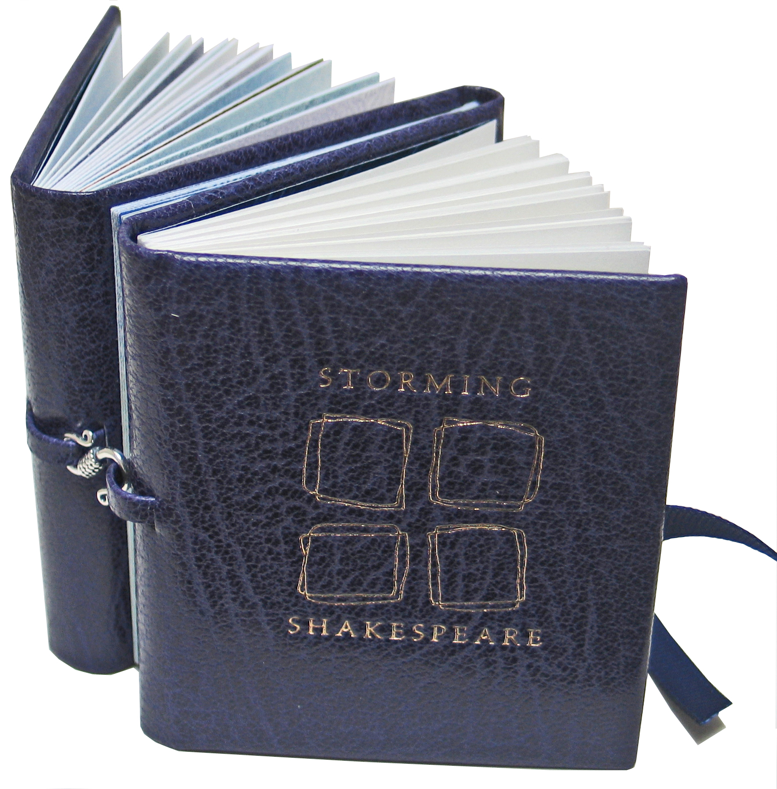
Triple dos à dos is the name I've given to the binding of this book, as it has four book boards in all, accommodating three text blocks. The first part is a conventional codex-style book, an essay which explores Shakespeare's use of the storm in the three plays. It is illustrated with two hand pulled drypoint prints, one of Trinculo taking shelter under Caliban's gaberdine ("The Tempest"), and the other a drypoint with chine collé of the Globe Theatre, after Visscher's engraving of 1616.

For the second part I selected quotations from "Julius Caesar" and "King Lear" and illustrated them with drypoint and monotype prints, supplemented with gold leaf illumination and water colour. This is bound in the form of a drum leaf book, with two illustrations for each play. For this section the letterpress printed quotations are on coloured monotype printed backgrounds, which I think of as stage lighting, there to assist the mood and emphasize the action.
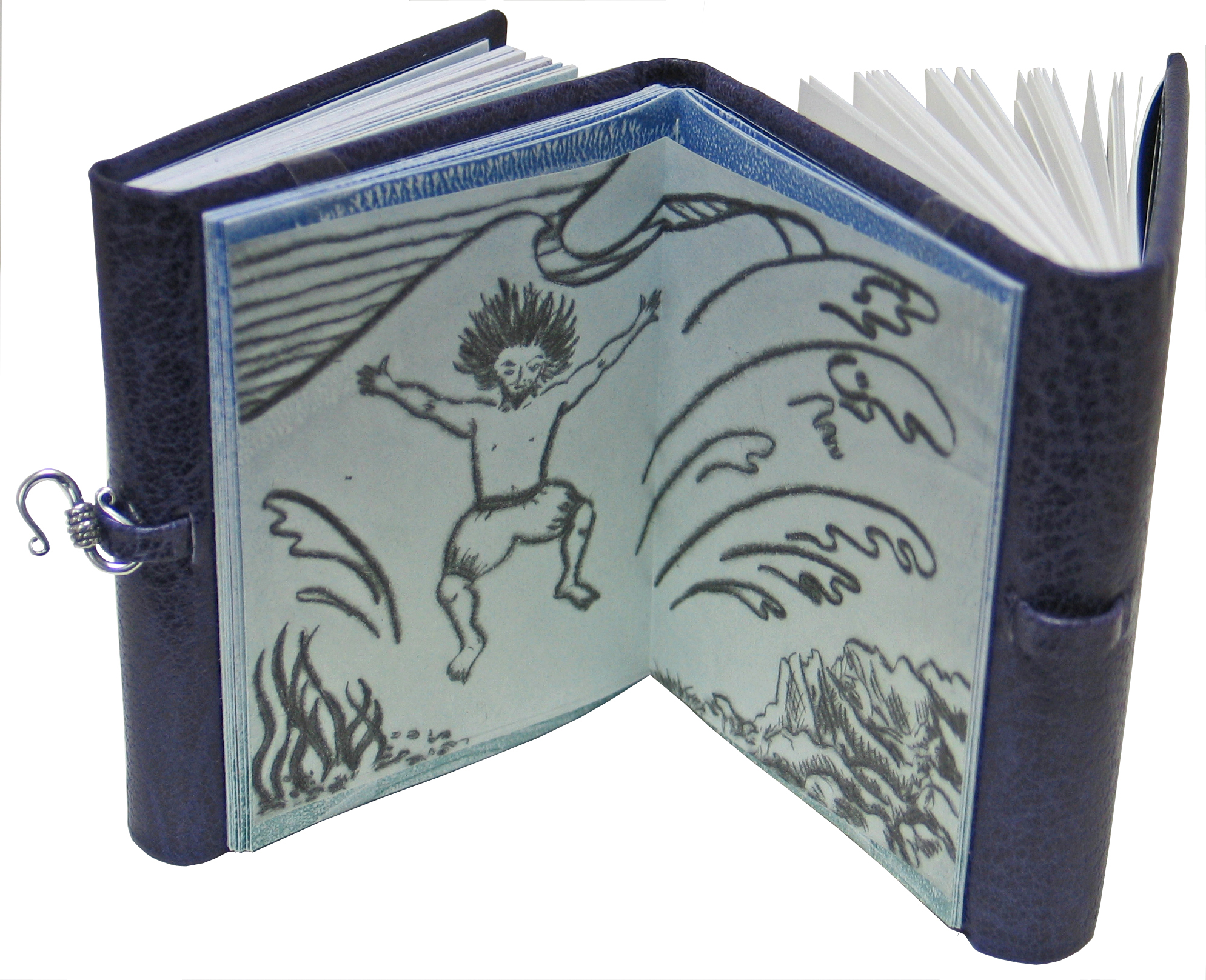
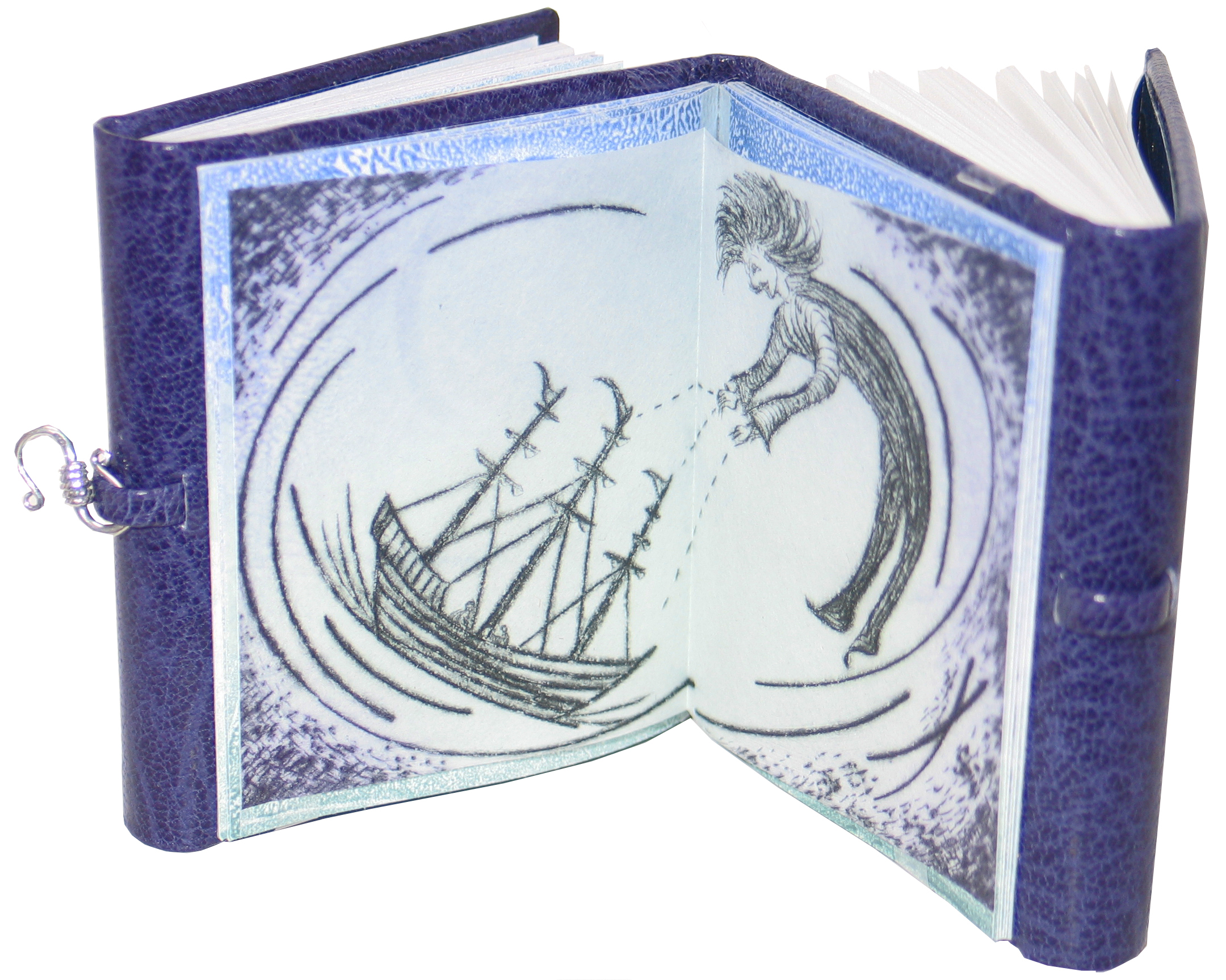
For "The Tempest" in the third section, monotype prints provide a stormy backdrop for the quotations and illustrations, printed on thin translucent Japanese gampi paper suspended between the pages to convey the dreamlike illusory quality of the play. This part is bound as a modified carousel book.
All are contained within the same storm-purple full leather binding, with gilt title and design on the front cover, representing the four elements shaken by the events in each play. The covers are fastened with ribbon ties on one side and a silver hook and loop on the other. The paper used for text and prints is Magnani Pescia Book, 100% cotton rag, with pastepaper endpapers in deep ultramarine blue with gold flakes, created for this book. Brioso roman and italic faces are used throughout, with titling in Zapfino.
The book measures 73mm high x 65mm wide x 28mm thick and is illustrated, printed, and bound by Jan Kellett. It comes with a leather-trimmed slipcase, in a Varied Edition of 20, signed and numbered. Price CA$ 895.00
What is a Varied Edition? Monotype printmaking involves creating an image on a plate, and printing that image onto the paper. To repeat the image, the plate is cleaned off and the image is recreated each time, so inevitably there are slight differences between them.
What is drypoint? A plate is incised with an image using a sharp point such as an etching needle. The plate is then inked, and the ink is pushed into the incised lines. Most of the ink on the surface of the plate is wiped off, leaving ink in the lines. The plate and dampened paper are then run through an intaglio press. The incision creates a burr along the line, and it is this that gives drypoint prints their characteristic fuzzy line. The artist can make this more or less pronounced by the way the line is incised and inked. Edition now sold out.
All images and text © Janet R Kellett 2013